Wednesday, February 22, 2006
A wee beastie

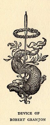
Here's a little colophon beastie from a book set in the Granjon typeface; the colophon states that Robert Granjon began his career as a type-cutter in 1523, and that he was one of the first to practice the trade of type-founder apart from that of printer. Between 1557 and 1562 Granjon printed around twenty books in types designed by himself. He lived and worked in Paris, Lyons, Antwerp, and Rome, where he worked both for the Medici and the Vatican presses. The Granjon typeface was designed in homage to him by George W. Jones (in the 20th century), and is based on the classic letterforms of Garamond.
All this information and more, and the beastie, appear in the colophon for the novel Corn in Egypt by Warwick Deeping (Knopf, 1942), and I happened across it because I was nosing around in the back of the book while checking for a bookseller's ticket. I enjoy reading colophon information, I always learn something, and once in a while come across something as good as this.
The word colophon comes from the Greek for summit or finishing stroke, and I tend to regard a colophon as the pleasing and appropriate end to any good book. Colophons started out as a way to place in the book all the information that is now found on the title page or copyright page, but the tradition has held over among many presses, if not just for a note about the typeface. I think we are all the better for it, as readers.
I've got an entire book on European printers' marks and devices. I'll have to bring it in to the shop so I can add a few more to this blog; many are quite elaborate and very beautiful. Marks were printers' ways to show their uniqueness and talent, and hopefully make their books memorable to customers and patrons. One of the most famous printer's marks is that of Aldus Manutius: the anchor and dolphin. I never did get a tattoo during my punk phase as a teenager and twentysomething, but if I had, this would have been it.